
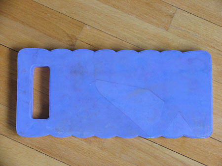
 "Garden Variety" foam kneeler - found at a garden center in the distant past. Apply paint liberally, then print on fabric.
First I made this print. (This is a detail shot.)
The fabric was ink jet printed several years ago. The initial fabric was not up to snuff - it had lots of black marks on the edges from feeding/roller problems, and it wasn't as vibrant as I'd hoped. I really had no idea how to improve it. It was time to go to town with Prochem's PRObrite paints. After I made the print I removed some excess paint from the fabric with sequin waste, creating the circle pattern. The ink jet print is visible as the terra cotta color with gray variegation.
Before doing more printing, I analyzed what was already printed. No big surprise - everything was a medium.
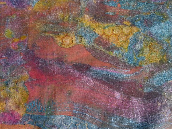
 I forced myself to try and make some pastels. Pastels, though necessary, are less fun to me. Whenever I dye or paint fabric the pastels look somehow not done enough. Of course, with no contrast, a quilt will generally not be as successful. So here are my pastel attempts - some more pastel than others.
The one with the squares was screenprinted while the background was still wet.
One thing that's been interesting to me during all this printing is using different types/brands of paints on the same print. Some of the paints are very fluid, like Dr. Ph. Martin's Ready Tex, others are creamy PROfab opaques or some truly ancient Versatex inks. In my experience the creamier paint, the more it makes distinct marks. The fluid paints create a more diffuse look. I often spray the print with water after it's made to blend the colors a little more. I'll also remove excess paint from a print using another piece of fabric - two for the price of one!
I hope everyone else is finding some time to have some creative fun.
2 comments:
Wow! You've been busy! Love the fabrics!
I love your dying fabrics, there are absolutelly beautiful !
Post a Comment